
Things that Make You Great Aren’t Scalable
Companies are obsessed with becoming “scalable.” Find out why that’s not what makes a company great.
Category

Companies are obsessed with becoming “scalable.” Find out why that’s not what makes a company great.
The MESH design team shares five ways to tighten up logo design for clients.
A memorable brand. That’s the most important aspect of a new business’ success. If your brand is easy to read and recognize, beautifully designed, consistent across different platforms and applications and embodies the heart and soul of your organization, you stand a better chance of being the first name on your customers’ lips when they need the products or services you offer.
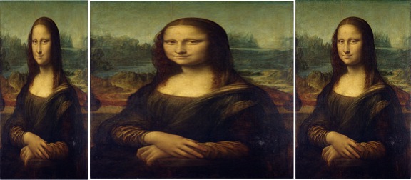
Would the Mona Lisa be a masterpiece if her canvas were stretched a few inches wider? She’d be some regular, fat lady with oval eyes and a smirk hanging in a bathroom somewhere. Stretching/shrinking causes words to look awkward, people to look odd, proportional spacing becomes disproportionate, and the whole look is off. Most importantly, it looks unprofessional.

Now more than ever it’s important that your brand personality comes through quickly and effectively on your website. There was a trend in 2010-2011 to strip away the brand personality and let content be the driving force for the website.
I have to agree with David Droga–to a degree–on his most recent interview with Ad Age Editor Abbey Klaassen. In the interview, Droga offered his thoughts on whether the golden age of advertising is still to come, or whether it now lives in the “Mad Men” drama series on A&E. His personal take is that we may be in it now, or at least on the cusp.

Here at Mesh, Gauge Construction & Development is a brand new name, and thus, needed a logo built from the ground up. Without the confines of past aesthetics or brand equity we were free to entertain a lot of ideas. Overall, the logo needed to be clean, strong, and as with most construction companies, it had to be a relatively quick read since it would most frequently be seen on worksite signage.
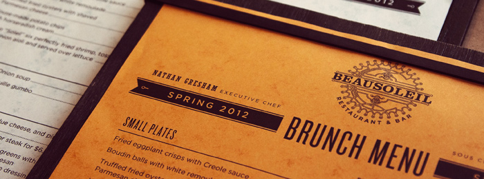
A quality chef knows you eat with your eyes. That’s why Beausoleil’s Chef Nathan Gresham and general manager Jeff Conaway looked to MESH for help in “setting the table” so to speak, and translating their culinary concept into a cohesive visual brand identity that effectively communicates the critically acclaimed restaurant’s fresh take on locally sourced dishes in the French bistro tradition.
These days — with so much of the business of printing done via email correspondence, PDF proofs, file uploads to ftp servers, followed by packages of printed materials showing up at the reception desk via express courier — it’s easy to lose sight of the integral role that the people who regularly service the customers play in making the process run smoothly and the results everything you’d hoped for.

The miracle of birth – whether it’s a beautiful newborn child or a long-awaited 85-acre hospital campus, it’s amazing to be part of the experience. Over the last thirteen months, we at MESH have been privileged to play a role in getting the word out about one of the most exciting developments in regional healthcare in many years and preparing the public for its highly anticipated arrival.
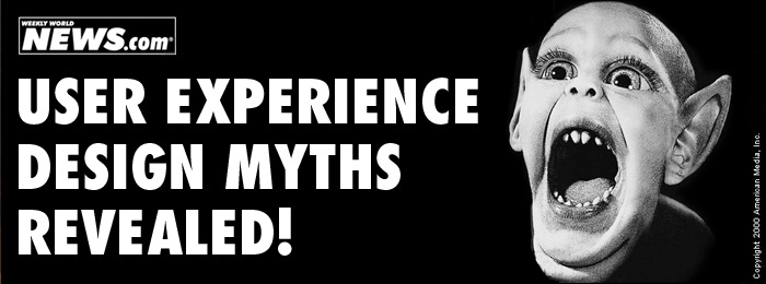
Over thousands of years, people have invented mythical creatures—unicorns, the Loch Ness Monster, Bat Boy—and in sticking with tradition, they continue to today. Enter the most recent to join the ever-growing list of folklore: people who don’t scroll. Similar to the aforementioned mythical creatures (all backed by eyewitness accounts) there is an assortment of user-experience design myths and misconception.
I’ve recently been ask to present “The Creative Process” to the local student Advertising Federation. This outlines my 6 guidelines when developing creative.