GMFS Rebrand
- Creative
- Media
- Strategy
GMFS has spent 25 years helping people write their next chapter. But it was time to write their own. With a logo that outlived its moment, a tagline that only told only half the story, and a visual identity that felt more dated than dependable, they came to MESH ready for a brand as transformative as the milestone they help people reach. In return, we built a brand with the momentum, clarity, and staying power to match who they’ve always been.
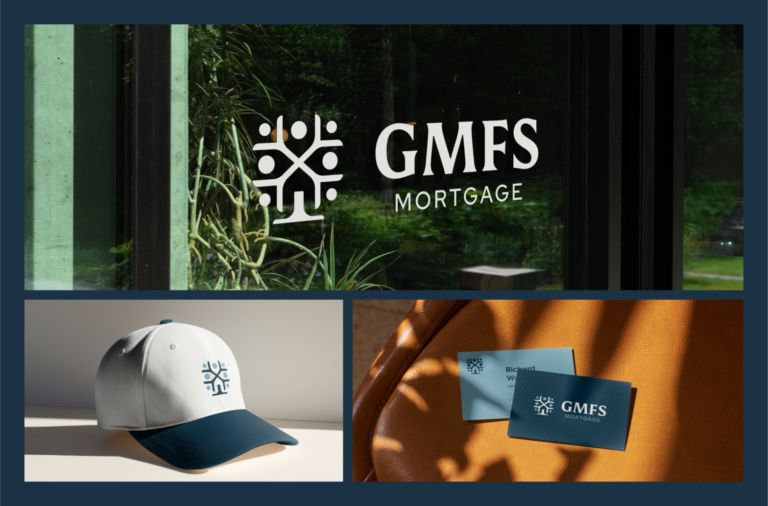
A logo and tagline that feels like home.
The old logo carried the visual weight of a courthouse, not a company that helps families buy a home. We worked on something that better represents the care the GMFS team puts into all their work and designed something warmer, more modern, and relevant. The new logo mark is approachable enough for a first-time buyer, credible enough for a B2B lender, and distinctive enough to stand out across every market in the Southeast.
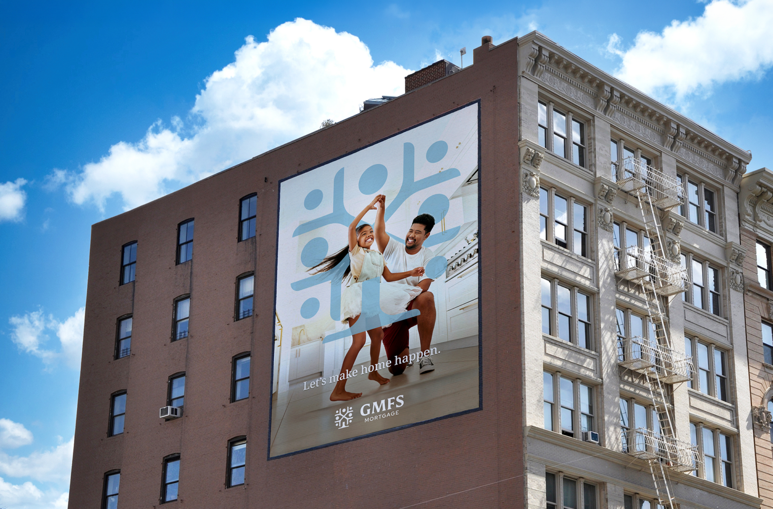
While the “Changing Lives” tagline reflected GMFS’s values and what they ultimately do, it didn’t clearly communicate what the company actually does day-to-day or the ease, optimism, and personal guidance behind the experience. We replaced it with “Let’s Make Home Happen,” a line that captures both the emotional outcome and the approachable way GMFS helps people get there. It speaks just as naturally to a first-time homebuyer as it does to a wholesale partner, giving both audiences a clear, inviting message with no ambiguity.
A brand voice and visual system that invites you in.
The brand voice overhaul matched the energy of GMFS’s best loan officers—experts in their field who genuinely care about your goals. We built messaging guidelines around the idea of lifelong guidance: GMFS isn’t just closing loans, they’re opening doors. The tone leans into warmth and specificity, replacing industry boilerplate with language that actually sounds like someone who knows your name and your neighborhood.
Beyond the logo, we developed a full visual system—color palette, typography, and brand elements—rooted in the same balance of warmth and professionalism that defines the GMFS experience. The palette moves away from sterile financial-sector defaults toward tones that feel grounded and livable. The overall system is built to scale cleanly across everything from business cards to branch signage, giving a 25-year-old company the visual toolkit to grow into the next 25.
Found faster, ranked better.
We overhauled the SEO foundation across both their customer and partner sites—clean structure, optimized content, and technical improvements that help GMFS show up when and where it matters most. We also built both sites to meet ADA compliance standards, ensuring the people GMFS serves can actually use the tools built for them, regardless of ability or device. In a regional market where trust and visibility go hand in hand, being easy to find is just as important as being easy to work with. And a brand that prides itself on removing barriers shouldn’t have a website that creates them.
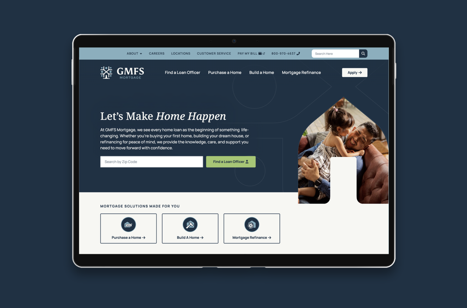
A proper home for 25 years of reputation.
The old site didn’t have much to say. The new one does. We restructured content to actually tell the GMFS story—their 25-year legacy, their culture, their community roots—in a way that earns trust before anyone fills out a form. Better hierarchy, cleaner layout, and copy that sounds like the people behind the service GMFS customers have come to know and love.