A powerful logo is both clear and memorable. Yet so many logos lack the simplicity to be clear or the personality to be memorable. Here at MESH, we put a lot of thought and time into designing a versatile logo for our clients because it will be the face of their brand.
As we’re developing a concept, sketching dozens of ideas and finally working and reworking the designs on the computer, we’re thinking through a lot of different variables. Here are five variables that you can use to evaluable your logo and see if it’s time to up your game and rebrand:
Is it necessary?
Always ask yourself if an element in your logo is necessary. What would happen if you removed that element? Would the audience be able to read between the lines still get what you’re trying to convey? Sometimes, removing an element will actually add a subtle uniqueness to your logo by revealing a hidden element that’s noticeable on second glance.
Does my type compliment my mark?
All typefaces or custom hand lettering have subtle design elements that should be reflected or contrasted in your logo mark. For example, if your logo type has a subtle curve, consider reflecting that same curve in your mark. Or if your logo type utilizes a thicker line weight, perhaps a thinner line weight contrasts nicely in the mark.
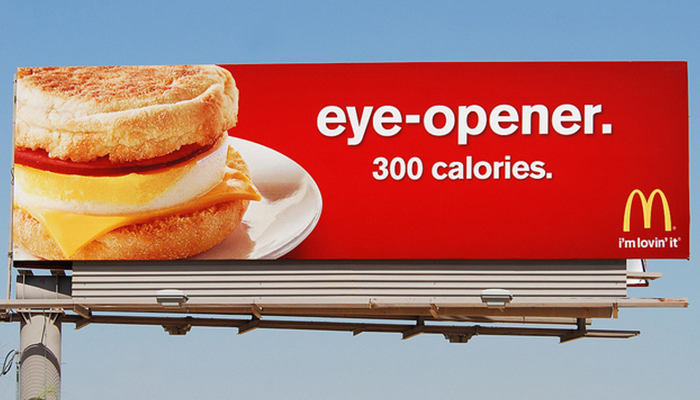
Can I recognize it when it’s small or at a distance?
Your logo might be used on a shirt or in the corner of a billboard and in any case, it should be recognizable and readable. If it’s too complex, it can hinder the audience’s ability to make that visual connection.
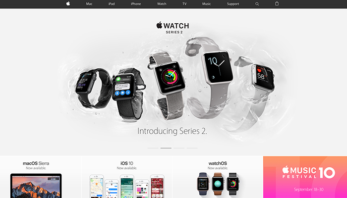
Can the mark stand on its own?
Your mark is the symbol accompanying your logo type. While not all logos utilize a mark in addition to their logo type, those who do should pay special attention to make sure the mark can stand on its own. Brands such as H&R Block is a super simple application of this rule — a green square — while Apple’s apple is a more complex application as it’s so unique. In fact, Apple’s logo mark is so recognizable after years of building brand equity that the word “Apple” isn’t even used on the homepage of their website.
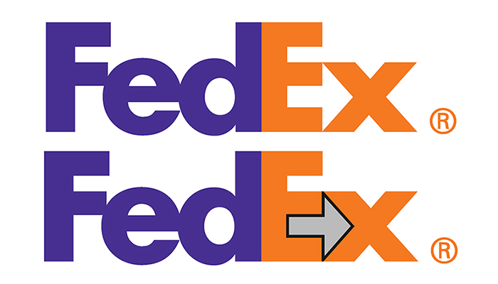
Is there meaning, hidden or obvious?
How is your logo mark connected with your company? Does it convey a principle or value that you believe in? Does it reference your company’s origin story? Or is it a more obvious connect such as a mascot? Put some thought into the meaning behind the logo mark because it can add another level of personality to your company.
Does it evoke the emotion that I want my audience to feel?
If you’re a law firm with a logo using Comic Sans, it’s safe to say that’s a bad logo… actually if you’re anyone using Comic Sans in your logo, it’s a bad logo. But you get the point. A training gym might use bold, thick lettering to evoke a strong presence while a nutrition company might use thin, narrow lettering to evoke a sense of weight loss.
